
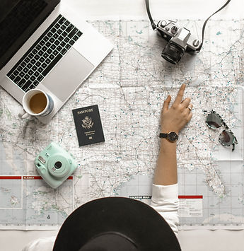
ONLO
ONLO (On Location) started off as a concept held by an early stage founder to create a travel app inspired by the appeal of Tik Tok. Millennial travelers need/want to find intriguing, authentic activities and experiences as they travel to new and exciting places. The idea of combining social media and travel planning is innovative, and our design team was ready to dive into the groundbreaking journey to create an MVP.
We needed to go through a full UX process to learn about the users, their travel habits, how they plan, or don’t plan, and other insights before we could really get started.
Role: Design Team Lead Tool: Figma Duration: 5 weeks

Research
Surveyed 75 Respondants
"When I'm on vacation, I don't want to have a schedule."
Six Interviews
Travelers want to live in the moment and not plan too much in advance, rather they want to feel out the area and be curious.
Discovery
The commonality is that they had to reference different resources when traveling.
Define

The persona allowed the team to recall the user needs of experiencing culture and other interests such as food, local connections, fun and safety.
How Might We
-
Discover - Highlight authentic activities/areas of interest for travelers
-
Explore - Help them to have fun & build global connections + share memories with friends and family
-
Search - Allow them to filter search information to find what they’re looking for
Competitive analysis of features like maps, social media video search, sharing, and travel planning helped us set the goals for our design plan.
-
Build a search feature similar to social media feeds.
-
Allow a map view that highlights places to go, things to do in the area
-
Design a library of saved travel destinations + activities organized for later reference and/or itinerary building.
Ideate
.png)
The team each created a mood board and together we agreed upon a color scheme that would reflect a timeless, playful and fun vibe.
We decided to use a UI kit to help us stay on track for our deliverable date that was just a few weeks away!
The colors reflect trust, fun, and excitement.

We put our heads together and involved the client in the process of creating our user stories and red routes.

.png)
We would create a route for:
-
Explore
-
Search (Map View)
-
Save (organize places of interest/planning)
Now that the problem has been clarified, it's time to design the solution.
My head was filled with many ideas and options.


I envisioned a way to plan and loosely create an itinerary based on the research findings that users like to sometimes plan their activities in advance. For example, if the place requires advanced planning, or just because they want a reference of places they want to see when they get there.

This idea for an itinerary would have to be included in phase two of the design process as we did not elaborate on itinerary planning for the scope of this project.
After presenting our ideas to the client, we each undertook a red route and created collaborated wireframes. With three designers working in one file, communication was key to share ideas, critiques and agree upon decisions together.
I designed the map flow
A user discovers a place of interest and wants to see the location on a map.

The client had a different idea for where the user could find this information on the screen (from the name of the city). This was a bad idea. It was important to let him know the significance of using familiar design icons that provide design consistency across common products in the marketplace.
We chose to link the maps with the location icon - as user testing validated that this is where users would intuitively go to find a map view.
You can see the locations color coded by type of activity/place, with label icons relative to your current location.
Ideally, the user could change the map view with the icon in the upper right corner to justify if they are on location or off location (browsing for places to go once they get to their travel destination).
.png)


Test
Each team member conducted 2 remote unmoderated user tests totaling 6 in all. I constructed user test questions in a Google Survey based off of the red routes.
Next, I analyzed the results within a spreadsheet and synthesized the data into a test report. There were a number of issues that presented themselves.

I think a moderated test would have allowed us to gain more insights given that this was an initial MVP first round of testing.
Three main issues were:
-
Search comprehension
-
Finding the Map View
-
Using the filter
My top recommendations for solving these problems are:
-
Make navigation features larger so they stand out
-
Use a map icon to indicate a map view is available (users will be familiar with this and easily recognize it)
-
Add a close button in the filter to navigate out, add more filter options for restaurants.
-
Have the homepage show local experiences (user can easily change that by searching for other locations)
-
Have top places and things to do present themselves first and then offer the option to filter from there
-
Have a list of popular cities auto-populated as suggestions in the search bar
Reflections and Learnings from the Process
-
With so many features the design of this app could have, it’s important to design basic features to begin with.
-
Then add from there with plenty of testing to validate satisfactory results.
-
Communicating design rationale upfront with the client and team by not holding back is essential.
-
It’s better to advocate for what you know is right, rather than wasting time.
Possible Next Steps for Future Iterations
I would refine the UI and omit anything that appears unnecessary or repetitive for the three basic features we agreed upon (Explore, Map, Save). Then I would update icons to ensure their comprehension.


Finally, I would conduct a moderated round of testing, and repeat the process.
-
I anticipate adding the map view setting would be helpful so the user could control whether they are looking at a map relative to where they are, vs. where they are searching.
-
With such an intricate design idea in its initial phase of design - overall the MVP looks great.
-
This serves as the foundation for a product that could revolutionize the way millennials and Gen Z travels. 😀